So, now that we've covered my
safe haven bedroom we can move on to the FUN parts of the house!! SO, welcome to the Smittle Family Home!!
This is the first thing you'll see when you walk in to our home. It's probably in the top five of my favorite things in our home. I bought it from IKEA, and it was well worth every penny! It makes fun polka dots all over the walls when it's on. So fun! The large tree print is also from IKEA. I loved the colors in it and the simple design. I found the smaller paintings in a folder I had kept from a nature art walk we did several years back. Each of the girls painted one of these. I love that they go so nicely with the larger print. A little tip: group like things together and suddenly it appears you have a little collection. This can be anything from vases to framed t-shirts(although the style factor may vary, the statement won't)

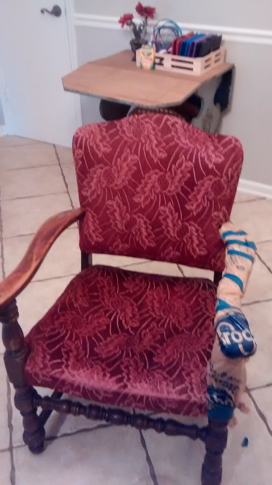
Another look at this corner. I'd love to find a big old retro floor lamp or a tiny table and a table lamp for this corner. No one ever sits in this chair, really, but I thought it made a nice statement. It's an old chair that I decided to spray paint. More on that tomorrow... The color on all of the main walls in the house is
Chelsea Gray by Benjamin Moore. I again pared it with
White Dove for all the trim work. We had an off-white color on all the trim originally and we felt like the jump to white really punched up the feel of the house. Because everything had been off white before we had beige outlets and switch plates, so Scotty learned a little electrical work and changed out ALL of them in the entire house for fresh white ones. It made a HUGE difference!! We also painted all the doors and spray painted all the knobs in a matching color.
Found this entry rug on clearance at Target for around $10. I love that it's funky but still pretty and has nice coloring.
The accent wall across from the front door. I totally snagged this paint from a girlfriend who had an extra gallon from painting her daughters room. The color before was really cool, and there is a really cool texture on the wall that we decided to leave that I'm pretty sure was created by applying tissue paper. I love the BOLD pop of color it provides to the foyer, and how it pulls a smile out of just about everyone who comes to my door. Even the mail lady complemented the color.
I got these mirrors from a friend who was finished with them. I'd like to add a long skinny table to this wall, and eventually I'll make one, but for now it's just fine.
This is a look at the foyer from the living room. I made the cornice board from some extra wood and burlap. Manly helped me think of a safe way to hang the giant thing. This window space is over 100" so we needed to be sure it wouldn't fall on the kids if they were to mess with it. I'll do a tutorial on that some day...maybe.
This is also a good visual for our new flooring. We got vinyl wood plank flooring over all the others for two simple reasons: price and durability.
Here is a description of what exactly it is. I originally wanted bamboo which would have been great(and someday I might have it), but I would have always been nervous about the kids ruining it. With this flooring I literally have wiped it with a wet rag after someone puked on it and it was fine. We've also removed gum, paint, and marker very easily. We have LOVED it so far. It's a breeze to clean, and SO SO durable with the kids. We(mostly Manly) installed it ourselves and if I do say so myself, it looks GREAT. Manly did an awesome job trimming it out afterwards and it looks so pretty and fresh.
Several of you have commented on my cross wall before, never fear, it made it into the remodel. We just moved it into the foyer. It looks really nice here, and again, brings in some pops of color.
This little half wall has been my enemy since we moved in. Our living room is very large, so it's nothing to do with space, it's just been hard knowing how to USE this little space. We decided to knock the thing down, but once we had hacked into it we discovered there was a PIPE in the middle of it!! SO, we learned to drywall, and put it back. I decided to just leave the barstools there as they were before, add a lamp, and a giant elephant(that my BFF gave me from her giveaway pile in her garage). It's a great space when we have a lot of guests over, because it adds extra seats, but also is its own little chatting space. Ideas on what to do???

I wish I was a better photographer so that you could get a better idea of how giant our sectional is, and how AWESOME this room is!! This is the sectional that started it all! I don't know WHY Manly and I decided to buy a GREEN couch, but we loved it. I'm so glad we did. It is SO cool and seats SO many people!! I'd love to add more pillows, but they are so darn expensive that I've just been getting them little by little. The painting? Why? No reason. I just fell in love with it, it went on sale, I bought it. I'd do it again. It's REALLY huge and sort of odd, but it's us. Ha!

Once I decided on the color for the walls, the next step was to make my burlap curtains! I knew from the beginning I wanted gray and burlap, and that's just what I did. They add a rustic charm to my otherwise totally funky style. I LOVE them. Bonus: they were NO SEW, and took me less than an hour to make!! The hanging lamps are IKEA, the piano(which I'd secretly LOVE to paint a mustard yellow color) is a family heirloom, and the fireplace is still not my favorite.
I just can't decide what to do with it. For now it's fine, but I'm just not in love with it.
Oh, that chaise lounge? Manly FOUND IT ON THE SIDE OF THE ROAD AS TRASH, picked it up, totally rebuilt it, and we put a vintage pillow from his grandparents house on it and BAM, one of the best spots for napping in the house! Print from IKEA.
I'll post on the dining room later, but this is the view from the living room. It's by far my favorite room of the house. (Swoon.)
Our family photo wall. These pics of our family are so special to us as they mark 10 years of marriage! They were taken by the very talented
LindseyFaith Photography. We highly recommend her! I changed out the shades on the lamps, spray painted them teal, and painted the frames a fresh coat of white. I love the personal touch family photos give a room. Side note: I'd love to add tin to the top of that side table. Probably will soon...
I got this cool painting from
The Not So Blank Canvas. Her work is so cool! Check her out! This is a tiny shot of the kitchen too. I'll post an update on that soon.
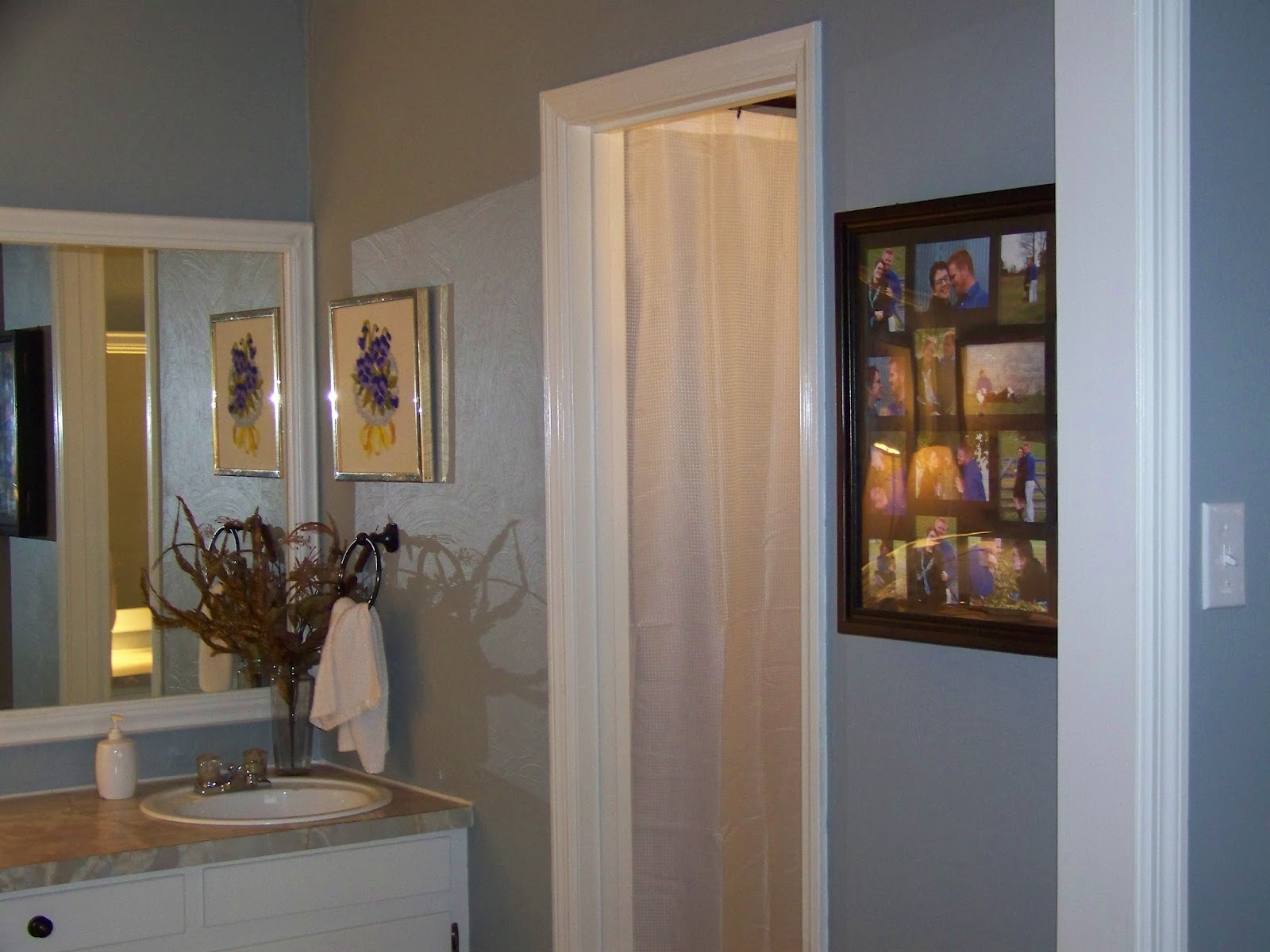
SO, last but not least, the guest bath. I mentioned in my Master suite post that we had TERRIBLE issues with PRE-WALLPAPERED sheetrock. Seriously, this was some back aching work! There were also SEVERAL layers of paper. By the time we got to the actual wall it was pretty damaged. We decided to do a really thick texture on the walls with joint compound. I love it! The color is
Kendall Charcoal by Benjamin Moore. It's one shade darker than my Chelsea Gray walls. I used it for all the smaller spaces. Don't be afraid to do a dark color on small spaces. We found that it actually made it feel a little larger.
I will be adding tile to the counter top OR just getting a new countertop(butcher block) all together soon, but for now it's fine. I got this SUPER cool retro medicine cabinet at Re-Store for $5!! Manly rewired it, we painted it a fun purple, and added Edison bulbs. I LOVE it!! It's really funky, but a great fit for a fun guest bath.
The vase was given to me as a house warming gift when we first moved in by my Aunt. It's always been one of my favorite pieces. It's HUGE, and looks GREAT in this space to add some white.
The painting on the left was a cool water color weaving that Lulu did.
Those AMAZING hand towels are from World Market. They are SO soft AND reversible. Ha!
An upclose look at the textured wall. It looks really cool and was REALLY easy. Joint compound, hands, and lots of time waiting for it to dry.
The toilet side. Ha!
That's all for now. Up next: Kitchen and Dining Room! Yay!