
Today I'll start our home tour by sharing our master suite. I knew when we made over our master suite that I wanted a space that would be a safe haven away from the rest of the house. I wanted a space where I could go in, close the door, and immediately feel at peace/restful.
First of all, I wanted a color that would coordinate well with the rest of the house, but also be very different. I had already chosen the colors for the rest of the house from the same paint card, so I just chose the lightest shade on the card for our room. It's Benjamin Moore Boothbay Gray [HC165]. It's a nice blue gray color. We decided to pair it with White Dove[OC17], also by Ben Moore.
I wanted to accent with different shades of green and aqua. In my original idea I knew I wanted the room to have a 50s botanical feel. I've really grown to love midcentury, and I had several pieces we received from our grandparents I wanted to incorporate. That and my signature green velvet chair. Ha! I love how it turned out. I'd like to eventually add white built-in bookshelves on the window wall, but for now things are great. The only things we still need to add in these rooms are the beadboard ceiling, and a sliding door between the bathroom and bedroom. Oh, and a big rug for the bathroom "entry."

This is the light fixture we put in the master closet. I'm not posting any other pictures of that room because...it's the closet. It's painted the same color.

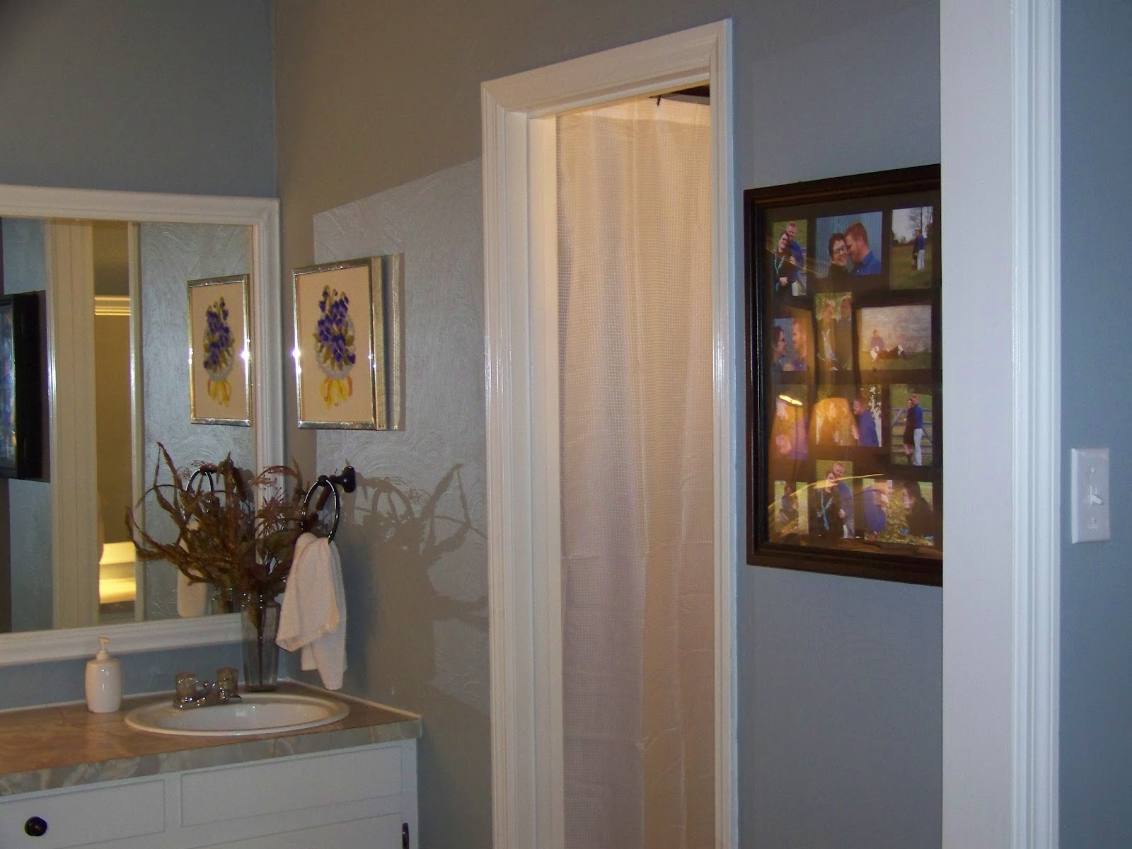
This is right outside the closet in the bathroom "entry." In this space we removed several layers of wallpaper which left the drywall looking rough. We decided to texture the wall by using joint compound. We simply gunked it up there and swirled it around. I love how it turned out. We also added a frame to the mirror to punch it up a little. I didn't want to lose the size of the mirror by putting in a more modern smaller one. This lamp was owned by Scotty's grandparents, the sweet picture was my grandma's, and there are lots of trinkets on the counter that belonged to our grandparents too. I love that we were able to use so many things that used to belong to them. It makes our room mean so much more to us.


I can't decide if I want to strip the rest of my hope chest or leave it like this. It looks pretty cool in person like this, but it would also look GREAT stripped and stained a tiny bit darker. All bed linens and curtains came from IKEA except the sheets which came from Target.

Cool burlap print from TJ Maxx.


The sweet print on this wall was a gift from Aunt Steph. It had a lot to do with the inspiration for my idea. The tray on the hope chest was a gift from Scotty's grandparents. Of course, you see my green chair. There is a vintage mother of the bride dress hanging over it that my grandmother wore in a wedding. I bought the octagon table at a thrift store for $5 and painted it white. The AMAZING lamps came from Target. I LOVE the tall floor lamp. It matches the ones on the bedside tables.

These sweet bird prints were my grandma's.

The "utility" side of the room. Ha!
OK, so there you have it! Up next: foyer, living room, and guest bath.

No comments:
Post a Comment